Visualizing Data
Just for fun, I decided to take a data visualization course at the School of Visual Arts this summer. Three hours a week for five weeks taught by Christopher Cannon, a data viz pro from Bloomberg News. From the course catalog:
“As data surround our everyday lives, data-literacy is fast becoming a necessary skill—the ability to interpret, share and critique such knowledge. Effectively visualizing that data can be informative, insightful, impactful… even entertaining. Information visualization has the potential to be a powerful tool for understanding our world, creating compelling narratives and clearly communicating ideas to others. Building on a foundation of core principles, students will explore a variety of ways to work with data and display it both accurately and elegantly. Students will create a visually compelling final project that tells a deeper and more meaningful story, drawing from data sources of their own chosen interest as well as those discovered in the process”
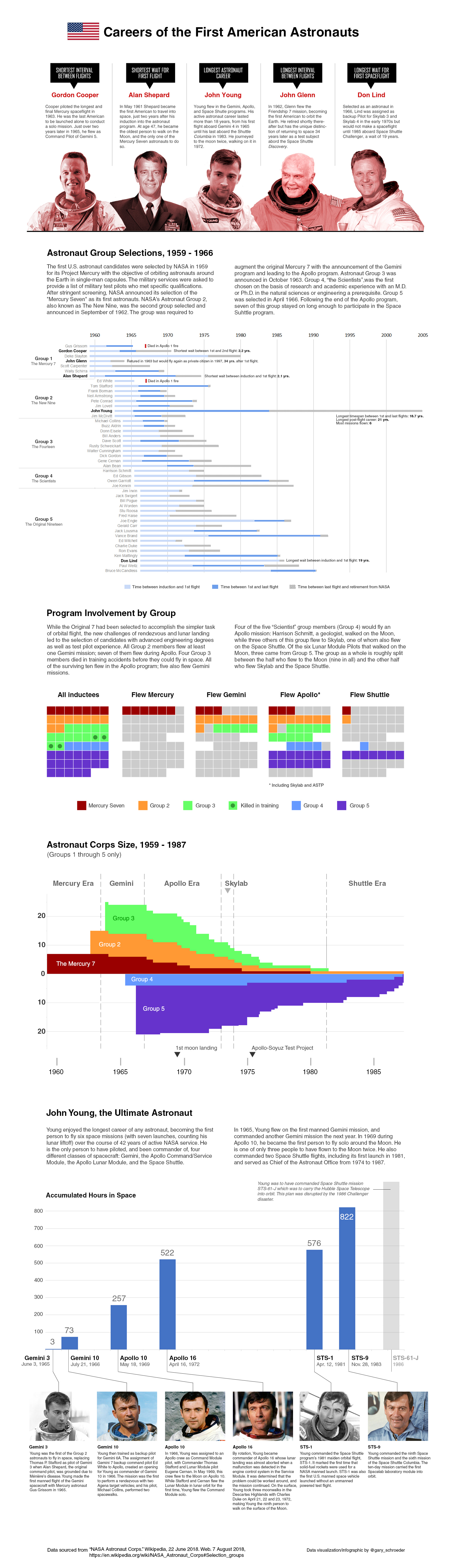
Now, if I'm given free reign to deliver a product on a topic of my choosing, there's a good chance that astronauts will be involved. There's a lot of readily available data on the topic and it fits the general pattern for data that makes for good visualizations. Namely that it have location information, that it's amenable to categorization or binning, that it has a hierarchy, or that it has a chronological attribute. Astronaut careers (or careers in general) certainly have those things. Careers have a chronology, they have start and end dates and specific events which take place in between; they have associated categories (type of vehicles flown, what class they were inducted with, and so on); and any number of location-related bits: birthplace, school location, places where training occurred, etc. Sifting for a few hours through Wikipedia coupled with several more hours in Excel and Photoshop lead to the final product below, a sort of combined data visualization and infographic.