Awwward-winning? Not So Much (Pt. 1)
Let's take a look at a website judged by the good folks at www.awwwawards.com as having an excellent navigation system. Does it stand it up to a detailed UX analysis?
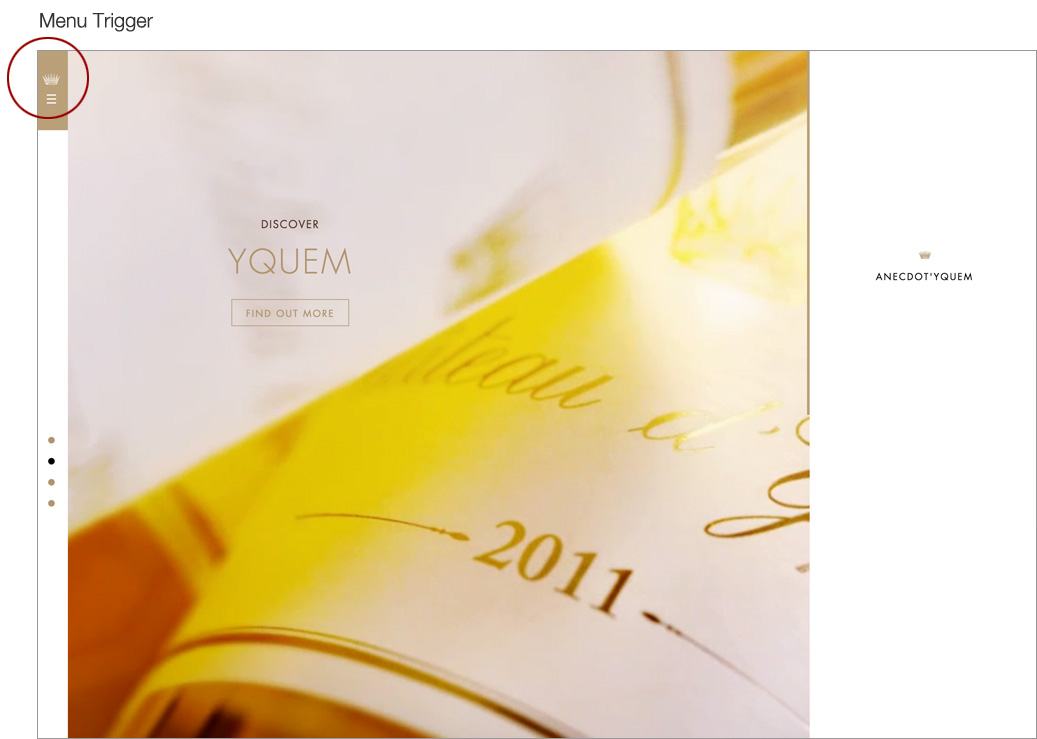
Chateau Yquem
Chateau Yquem (pronounced EE- kem) is a French producer of Sauterne wines located in Bordeaux. Their entry page is composed of a series of images that gently zoom and drift, Ken Burns-style, in a repeating slideshow, each with a call to action to “find out more.” A series of vertically stacked dots in a slim left-hand column indicates which of the four slides you’re currently looking at. Above the slideshow progress indicator is a golden box with a small, almost unnoticeable hamburger menu icon. The hamburger exposes a large slide-out with just a few menu options: four global navigation options, two social media icons, links to two vintage selector tools, and a footer which contains three links and a language selector. The Yquem logo serves as a hyperlink to the home page. The slide-out menu occupies half the screen and is dominated by empty white space. Generous white space and spartan layouts are the hallmark of luxury brand designs, an aesthetic which is in perfect accord with Chateau Yquem’s image.
Chateau Yquem home page
Choosing a Vintage
The vintage selector located in the slide-out menu is itself animated. In response to selecting “Find a Vintage,” the section containing that menu item is replaced with a year selector interface. The menu swap that occurs in response to choosing the vintage selector happens asynchronously (likely via AJAX) and does not disrupt the current state of the page, i.e., the gentle animations taking place in the background are not interrupted, leaving the user experience smooth and non-jarring. The odd thing about the year selector is that--in defiance of standard UI conventions--it requires the user to understand that they cannot type a year (represented only by a capital “Y”) directly and that they must highlight a digit in the year that’s initially shown in order to choose a different year. In a conventional design, this would be accomplished through a drop-down. This non-standard approach caused me a moment of confusion. I had to test the interface in order to be certain I understood how it worked, generally not something you want in a design.

Yquem's pretty--but unfamiliar--interface for selecting a year vintage.
Non-Standard for Sake of Luxury
The designers of this site chose their own unique approach to strengthen the “luxury” nature of the site. The selector is clever, elegant, and attractive. In this application, where the cognitive load is low (all you have to do is choose a single thing at this point) this seems acceptable. Another odd bit about this interface is that a left-facing arrow is what suggests that the digit boxes control the year. Once a new digit has been selected, a right-facing arrow appears and points toward the search icon, an actual prompt for the user to carry them on to the next step. These subtle UI changes give me the sensation that instructions are being whispered to me. That’s pleasant, but choosing a year is such a common online action that I’m not sure I’d throw convention overboard here. In a standard UI, I would have expended no thought making a year selection.
UI Problems
An annoyance with the site interaction is that once a vintage has been selected and I’m taken to the results page, I’m prevented from simply returning to the previous point of departure by using the browser’s “back” button. Doing so returns me to the entry state of the home page in which the slide-out menu is closed. I have to re-select the hamburger icon and the vintage selector link. That’s two extra clicks to get back to where I left in case I fat fingered my year selection. Since browsing vintages is one of the key functions of the website, this is a poor feature. The site’s designers may have allowed their desire for visual elegance to trump important functionality. There is a “Back to the Vintages” link at the top of the results page, but it takes me to a completely different interface, not the one that I just left. I’m forced to learn a new UI to complete the task that I just accomplished through a different UI. The designers could have avoided the faux pas by simply pushing the user to the master Vintages page right from the start.
On a second pass through the site, I notice that there actually is a way to get from the main navigation slide-out to the master Vintages page, but it requires the user to first choose the “Yquem” link. Unless that link is clicked, that option remains hidden, while the vintage selector at the bottom is always exposed no matter what action is taken. This suggests that the vintage selector at the bottom of the menu is for the expert user who is familiar with the site and wants to bypass the master Vintages page which is more geared toward persuasive marketing.
Difference in Mobile UX
I note that the mobile experience is quite different. The menu options are reduced and the user is given a direct option for searching through vintages. I disagree strongly with the designer’s choices here. Even though I knew exactly what I was searching for (a vintage selector), I spent over 30 seconds trying to find it. Why? Because even though the search interface is located at the top of the page, it looks like a title bar or label. I never apprehended it as a search interface and the magnifying glass icon, while present, did not jump out at me. The site’s designers chose another non-standard pattern here: the search interface is not an interface at all, but a button which, once clicked, reveals a slide-down menu with a very clear UI. Exposing that menu in the default state, would dramatically improve the site’s usability, leaving them plenty of white space for the remaining menu options with room to spare.

Take-away
I wonder how much this award was based on aesthetic beauty rather than UX considerations. Chateau Yquem’s website is undeniably beautiful, both on a desktop screen and on a mobile device, but they’ve produced a design which makes simple things difficult. By definition, that’s bad design. As a designer, I appreciate the seduction of crafting beauty over utilitarian functionality, but the proper balance has to be struck between the two in order for a design to be truly successful.